
Visual Identity & Expression
Eastern Metal Supply Rebrand
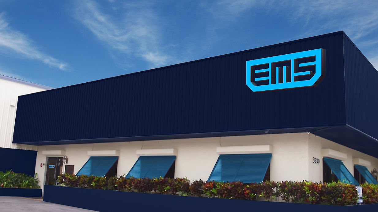
Eastern Metal Supply (EMS) is known in the business of aluminum extrusion as one of the leading suppliers and manufacturers. Yet being one of the best they still needed to a better way to define who they were and what they did. The aluminum extrusion market is based on the idea of supply and pricing. EMS was viewed as a "value-added" partner, but what does that mean? It needed to be redefined. We took them from "product power" to "people power," from "we have everything" to "we've got you covered" and from "vendor of products and services" to a "partner in business growth."
From a visual standpoint, this meant we needed to refresh their logo and create a visual expression that represented the redefined version of who they are.
Role - Creative Director
Designer - Alex Michalko

.jpg)
_Page_03.jpg)
_Page_04.jpg)
_Page_06.jpg)
_Page_05.jpg)
_Page_07.jpg)
_Page_08.jpg)
_Page_09.jpg)
_Page_10.jpg)
_Page_11.jpg)
_Page_13.jpg)
